


Shared DNA, a character of its own: how Billingo AI became Suara
Meet Suara, Billingo's vibe coding platform.
Go to Website- Brand strategy
- Brand name
- Brand and logo design
- Brandbook
- Web UI designs
In 2025 we rethought Billingo's invoicing brand with them, and the Cheat Code was born. In 2026 a new product followed, built from the same DNA, but no longer an invoicing tool.
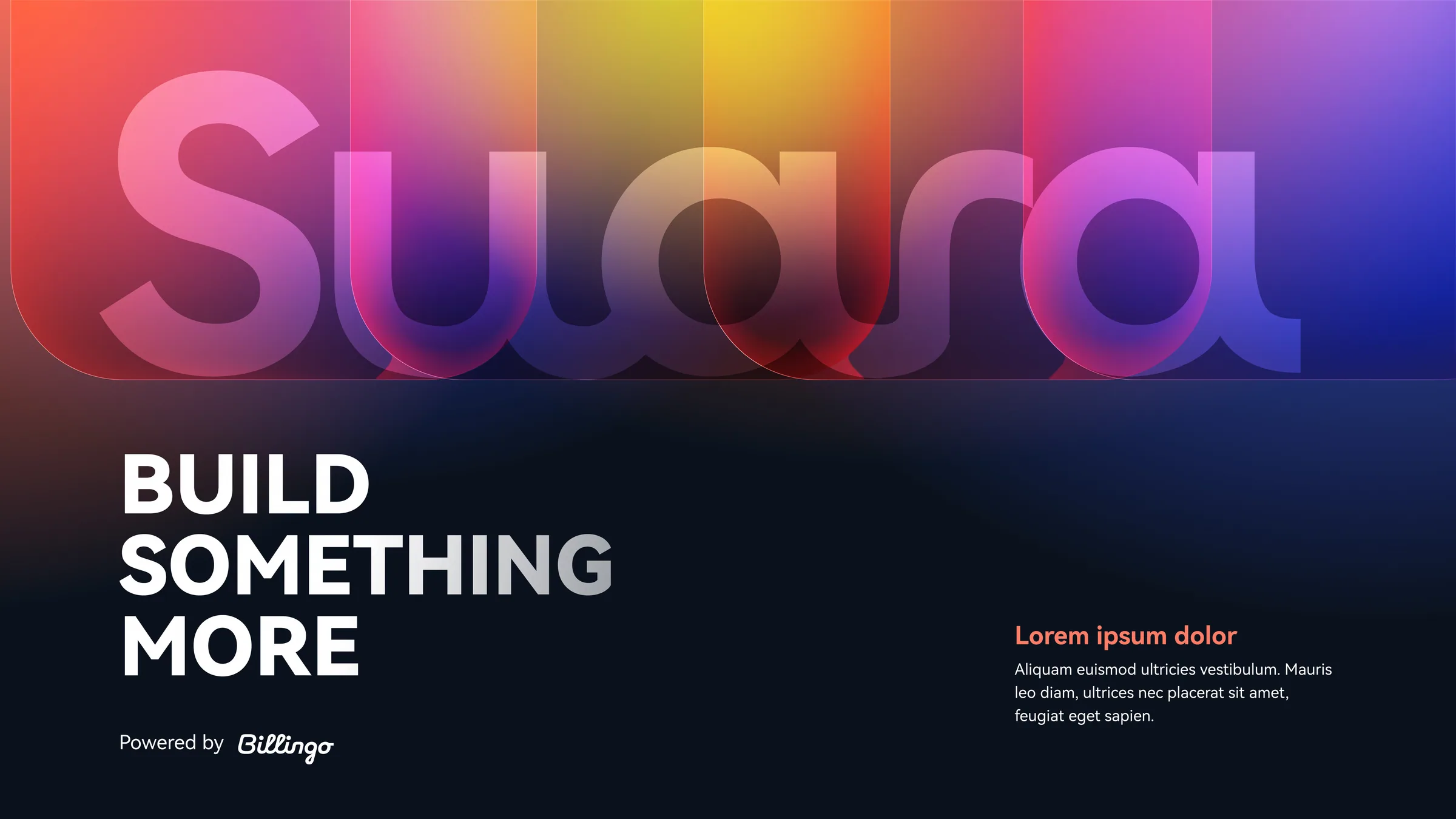
Its working title was Billingo AI: a creative space for entrepreneurs where websites, apps, calculators and automations are built from a simple description, without coding, and where the company's existing systems are connected. Our job was to give it a strategic foundation, a name, a visual identity and a visual language for its interfaces. It had to belong clearly to the Billingo family, without looking like a new Billingo feature.
“After our earlier good experiences, it was only natural to trust zwoelf with creating the new brand too, and they did not disappoint. They were with us from the first strategic idea all the way to launch. They didn’t just design beautiful solutions: every decision they made was backed by the concept, which is why the whole brand became unified and consistent.”
Brand strategy
The work started with a workshop where we went through, together with the Billingo team, what connects and what separates the two brands. This became the new product's MVB (minimum viable brand): vision, mission, audience, value proposition, personality, brand architecture, visual and communication guidelines. It served as the common ground for naming, identity and UI design.
The key decision was the brand architecture. Conceptually, the new product is more than an invoicing tool: it is a layer that makes a company's existing software smarter. At brand level, though, it cannot sit above Billingo, and it cannot look like the next generation of Billingo either. So we chose an endorsed brand model: a name of its own, endorsed by "by Billingo". The line is sharp, but Billingo's DNA is clearly the foundation.
The personality builds on the same traits as Billingo's, with a different emphasis. Billingo is first of all a mentor. The new brand leans towards the liberator: it gives entrepreneurs a tool to break free quickly from the limits of software and subcontractors. The mentor stays strong, though: freeing users is not enough, they also need help knowing what to do with that freedom.
This set the direction for communication too. The main message: the product frees entrepreneurs from the limits of their systems. No coding skills needed, no need to understand APIs, and it works with the tools you already use. We never talk about it as a developer platform, and it stays out of the race between invoicing tools: Számlázz.hu users are welcome to keep their invoicing software.
Naming
From the start, the brand was designed to work beyond Europe as well. So for every name candidate we checked its meaning in other languages and cultures, domain availability and trademark registrations. From the shortlist, Suara came out on top.
The name was born where "suave" (smooth, flowing) meets "sono" (sound, music). It describes the moment when a business comes together and the parts are worth more together than apart. In Indonesian and Malay it means "voice", a good fit for a product where all you have to do is say what you need.
Identity
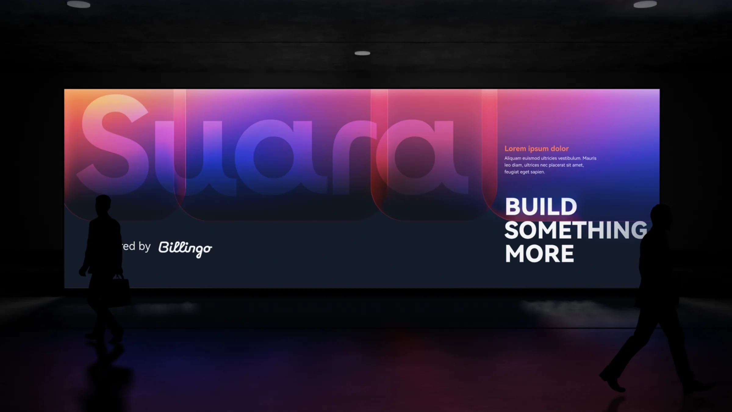
The logo's rounded, organic lines subtly echo Billingo's character, while the overall impression is cleaner and more modern, closer to the world of contemporary AI tools. The "by Billingo" endorsement is part of the logo. Below 40 pixels in height and in narrow spaces the emblem takes over, and the app icon shows the full logo so it stays recognisable at small sizes.
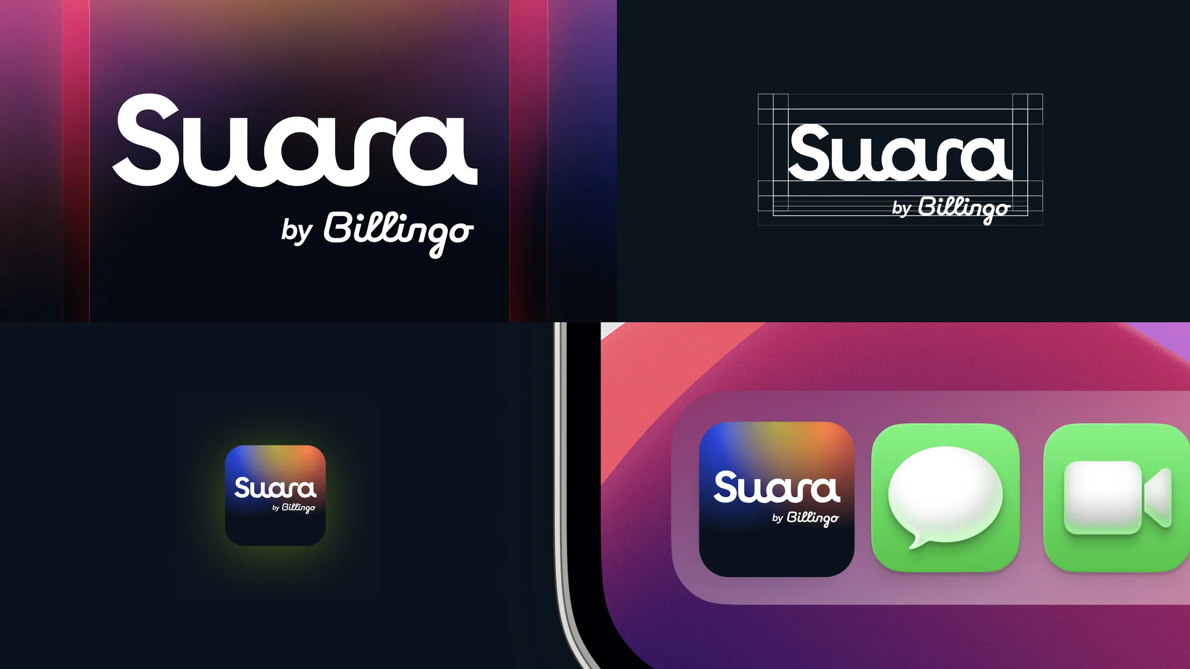
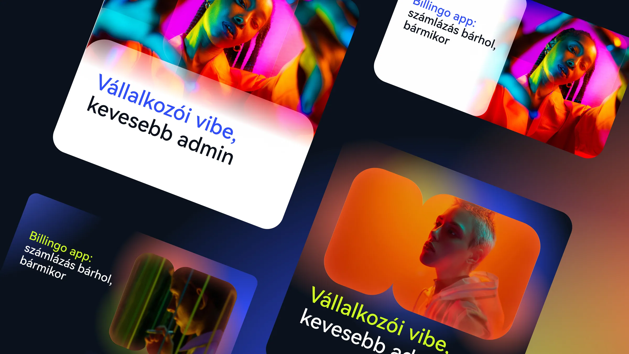
The palette is based on Billingo's familiar blue and coral, joined by a vivid neon yellow that brings freshness and energy to the system. The base colour is a deep dark blue that makes the gradients almost glow. One key point of the brief was to avoid tech clichés: warm, human accents instead of neon green code, everyday people in neon light instead of developer stock photos.
The main graphic pattern is the same shape used in Billingo's system. Here it plays a bigger role, as background or frame, with a subtle glass effect. The two brands feel very different, yet the shapes and the rules for using them tie them together. The margin system is Billingo's too, so a Suara and a Billingo layout read as one family side by side.
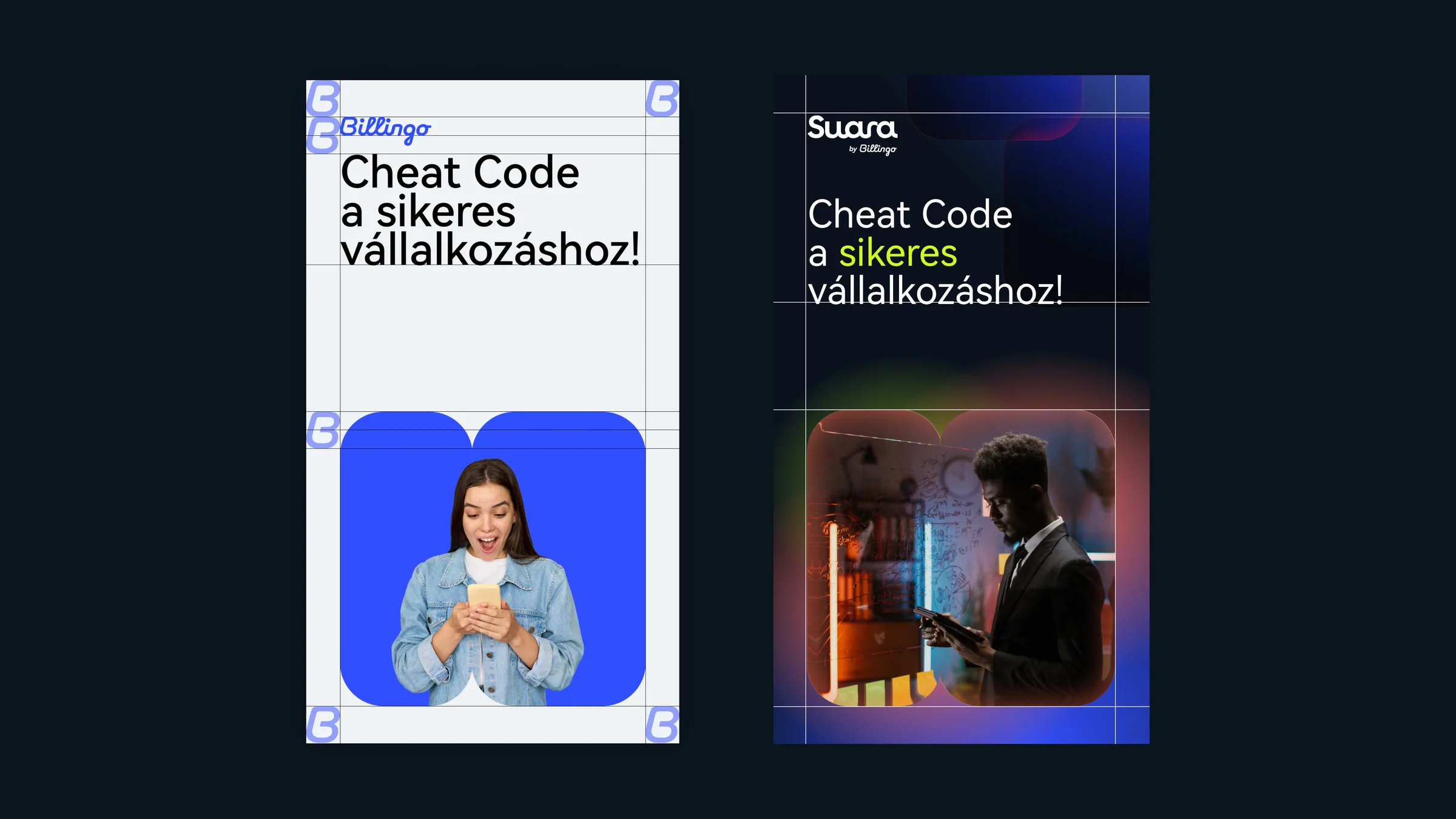
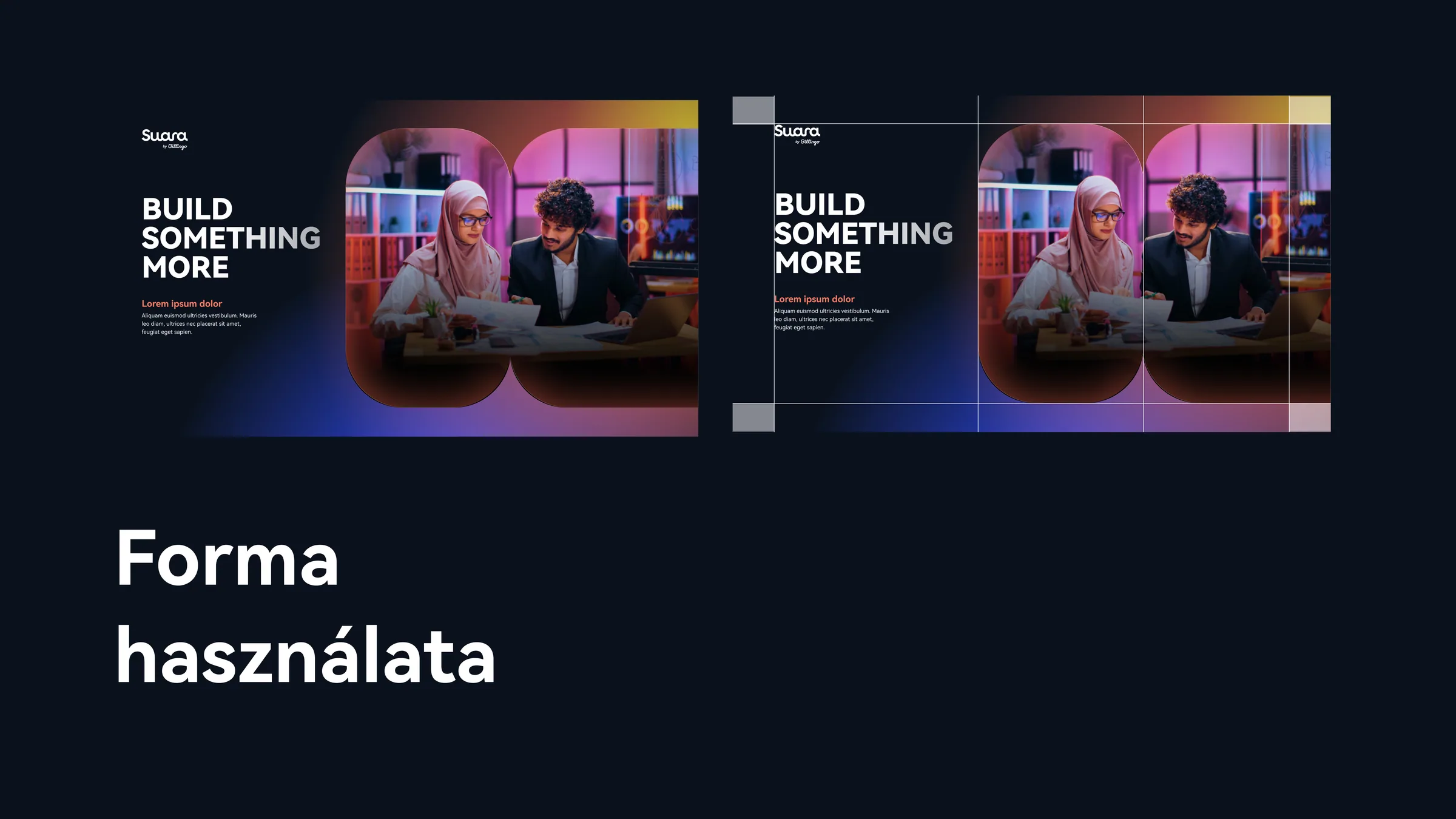
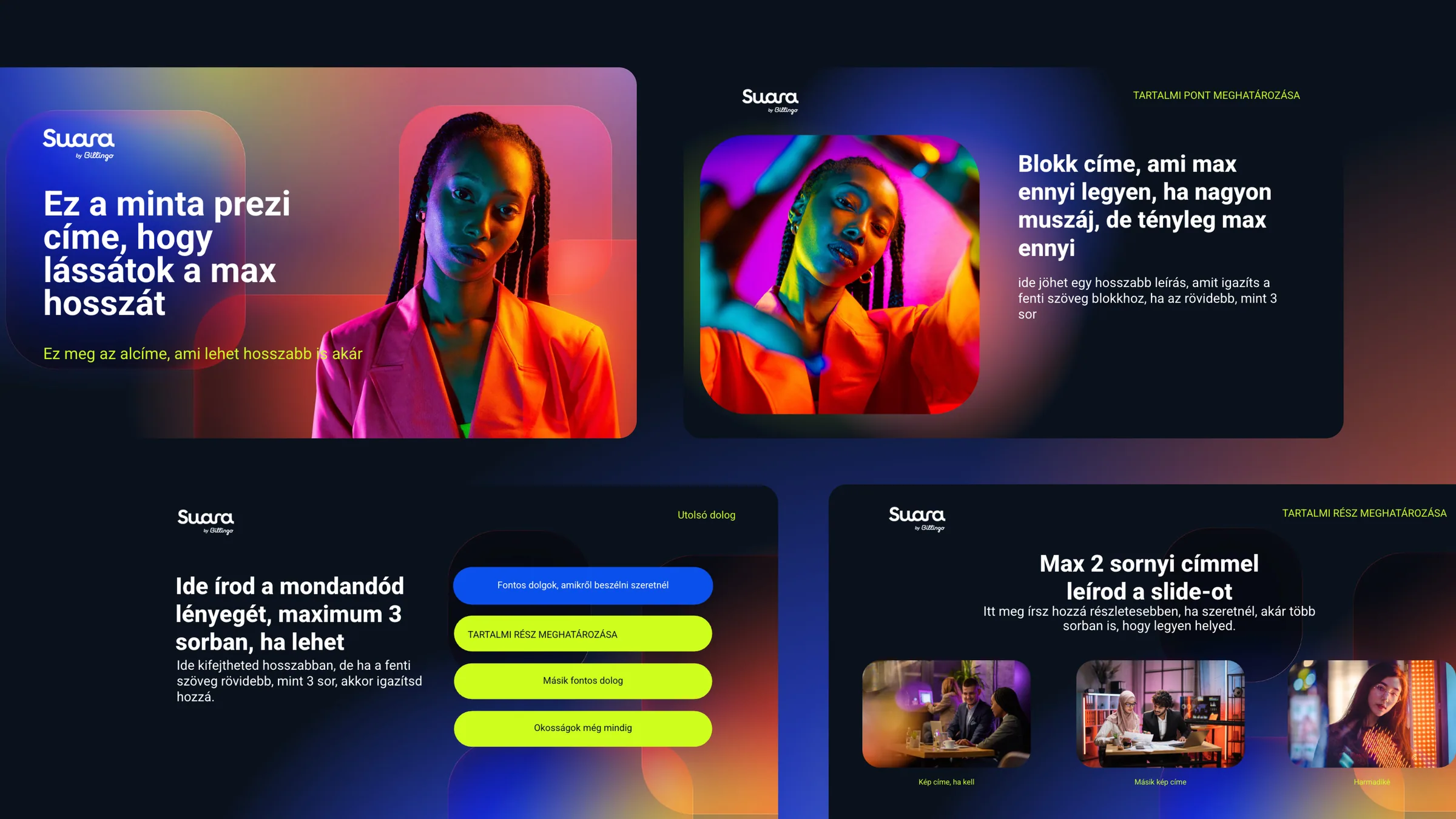
Typography is shared as well: the HarmonyOS Sans family comes from the Billingo identity. The brandbook defines logo usage, colour ratios, gradient rules (on no more than 60 percent of a surface, always on a dark background), photography and icons, and includes application templates: presentation, social media and email signature.
Web UI
The platform is built on the idea of a creative space for entrepreneurs: you say what you need, Suara builds it, and you refine it in words. This idea guided the interface design too. Dark mode is the creator mode, when you build your solution; light mode is the consumer mode, when you use the finished solution every day. The design system supports multiple languages and currencies from day one.
Suara launched in November 2026 at suara.hu.